
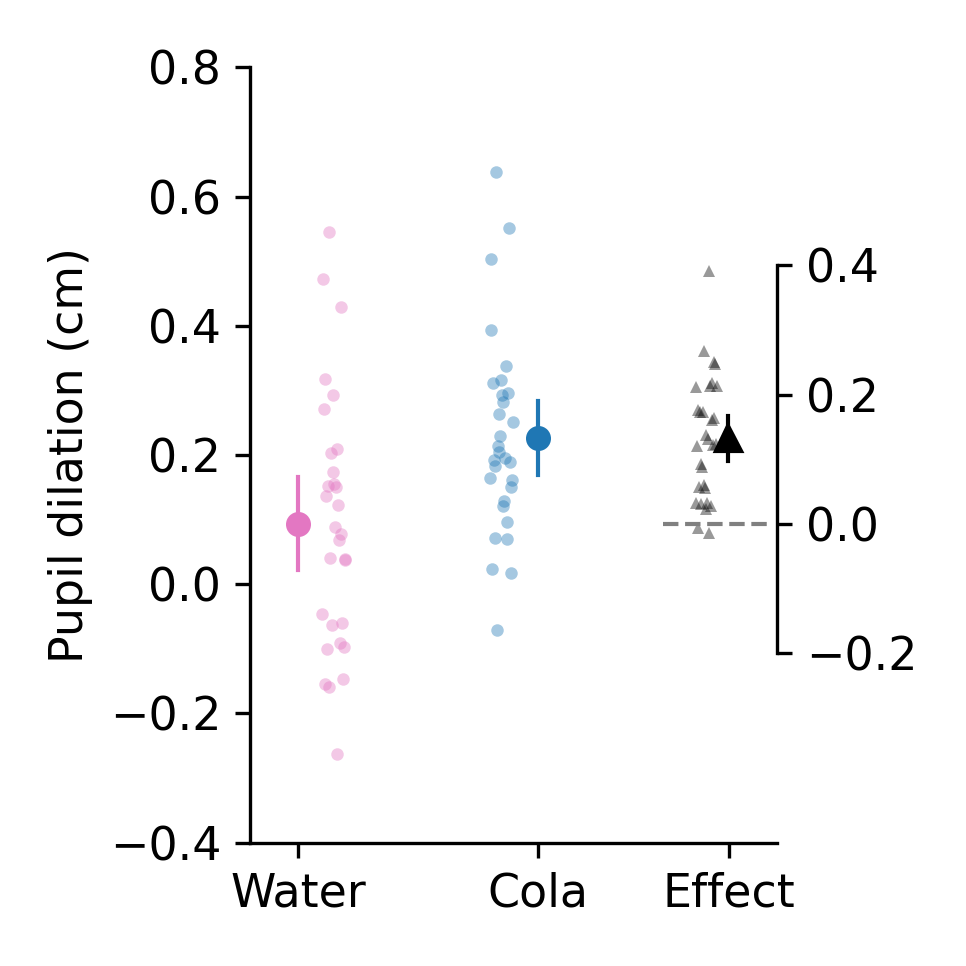
pliffy makes difference plots, plots that are simple and informative. At present, pliffy makes difference plots for two independent groups (e.g. treatment vs control) or for two measurements made in the same group (e.g. pre-treatment vs post-treatment). All raw data points are plotted by default, and data is summarised with the mean and confidence interval. The confidence interval is calculated using the appropriate t-distribution and is set to 95% by default. Here is an example:
pliffy plots are simple to generate. The simplest pliffy plot requires only two inputs, data_a and data_b. Because these two datasets (a and b) are used to compute the d-ifference, these plots are referred to as abd plots.
First Steps
The first thing to do is install pliffy and make sure it’s working properly.
Tutorial
If this is your first time using pliffy, it is recommended that you work through the tutorial.