Tutorial
This tutorial will get you up and running with pliffy in 5 min.
Part 1. Import pliffy, generate simulated data and prepare plot info
With the virtual environment you created during the Installation activated, start Python and type the following:
>>> from pliffy import PliffyInfoABD, plot_abd
>>> import random
>>> random.seed(42)
>>> data = [random.random() * 100 for _ in range(60)]
>>> data_a = data[:30]
>>> data_b = data[30:]
>>> info = PliffyInfoABD(data_a=data_a, data_b=data_b)
The above code imports the two key elements that we need from pliffy and the random module. We then generate random data and assign it to the data_a and data_b parameters of the PliffyInfoABD object.
Part 2. Generate pliffy plot for independent observations
To generate our pliffy plot, we simply have to pass info to plot_abd.
>>> plot_abd(info)
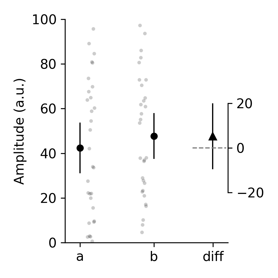
The above figure is the default pliffy style. It assumes that data_a and data_b are independent and the confidence intervals are all 95%.
pliffy also prints the results to our Python console:
--------------------------------------------------------------
outcome                 mean              95% CI
--------------------------------------------------------------
a                       42.63          32.17 to 56.72
b                       61.94          54.33 to 79.93
diff                    20.26          16.02 to 26.87
--------------------------------------------------------------
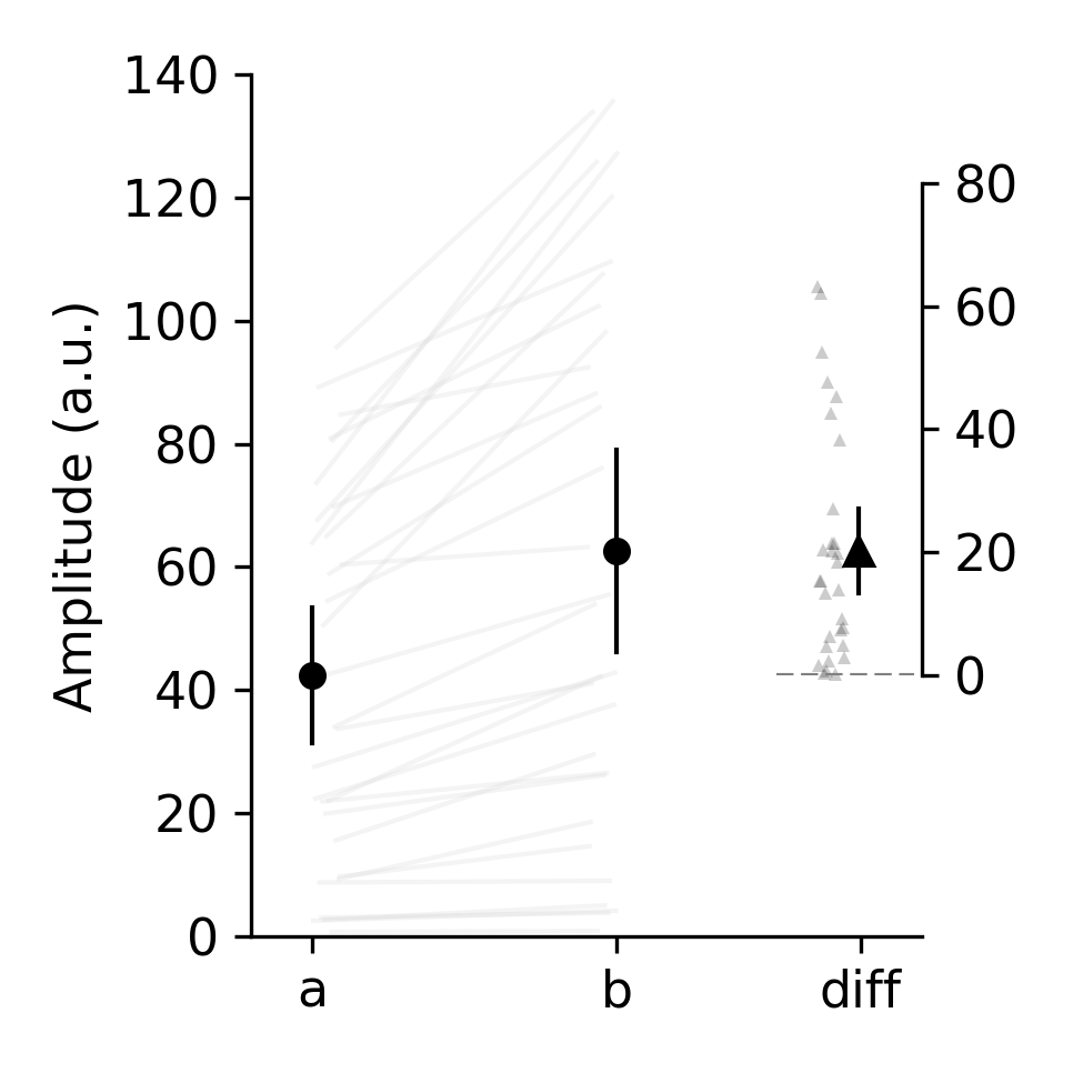
What if our data were paired?
Part 3. Generate pliffy plot for dependent (paired) observations
First we will create a new version of data_b that is dependent or related to data_a. Then we will specify that the data are paired by specifying a design parameter.
>>> data_b = [val * (random.random()+1) for val in data_a]
>>> info = PliffyInfoABD(data_a=data_a, data_b = data_b, design="paired")
>>> plot_abd(info)
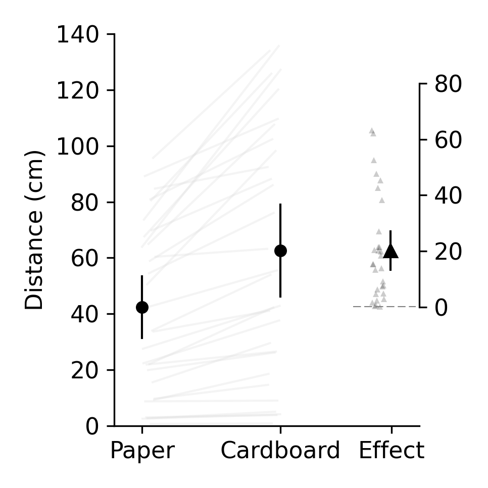
Great, but the data actual reflect the distance ants can walk in 30s when they are carrying a piece of paper or a piece of cardboard. Let’s add these details to the x-axis and y-axis labels to make our plot more informative. To do this, we will have to import ABD from pliffy.
>>> from pliffy import ABD
>>> info = PliffyInfoABD(
            data_a=data_a,
            data_b=data_b,
            design='paired',
            measure_units='Distance (cm)',
            xtick_labels=ABD(a='Paper', b='Cardboard', diff='Effect')
        )
>>> plot_abd(info)
Part 4. Taking full control of our pliffy plots
What if we want some additional control of our pliffy plots? While pliffy uses sensible defaults, we may want to change a few things. To know what we can change, we will print out an empty instance of PliffyInfoABD:
>>> PliffyInfoABD()
    PliffyInfoABD(
        data_a=None,
        data_b=None,
        ci_percentage=95,
        design='unpaired',
        measure_units='Amplitude (a.u.)',
        xtick_labels=ABD(a='a', b='b', diff='diff'),
        decimals=2,
        plot_name='figure',
        save=False,
        save_path=None,
        save_type='png',
        dpi=180,
        marker=ABD(a='o', b='o', diff='^'),
        marker_color=ABD(a='black', b='black', diff='black'),
        summary_marker_size=ABD(a=5, b=5, diff=6),
        raw_marker_size=ABD(a=3, b=3, diff=3),
        raw_marker_transparency=0.2,
        paired_data_joining_lines=True,
        paired_data_line_color='gainsboro',
        paired_line_transparency=0.3,
        paired_data_plot_raw_diff=True,
        ci_line_width=1,
        fontsize=11,
        zero_line_color='grey',
        zero_line_width=1,
        show=True,
        width_height_in_inches=(3.23, 3.23),
        )
Wow! That is a lot of options. But don’t get overwhelmed. The best way to learn what these parameters do is to look them up in the reference guides (pliffy.PliffyInfoABD). Alternatively, we can simply change some of the values and see what we get. For example:
>>> info = PliffyInfoABD(
        data_a=data_a,
        data_b=data_b,
        ci_percentage=90,
        design='paired',
        measure_units='Distance (cm)',
        xtick_labels=ABD(a='Paper', b='Cardboard', diff='Effect'),
        marker=ABD(a='s', b='s', diff='^'),
        marker_color=ABD(a='tab:pink', b='tab:blue', diff='black'),
        summary_marker_size=ABD(a=7, b=7, diff=8),
        raw_marker_transparency=1.0,
        paired_data_joining_lines=False,
        ci_line_width=2,
        fontsize=6,
        zero_line_color='tab:red',
        zero_line_width=2,
        )
>>> plot_abd(info)

That is an ‘interesting’ looking figure. As you can see, pliffy is powerful. But that power can be abused and unaesthetic figures generated. You have been warned!
What next?
Hopefully you were able to follow along and learned the basics of pliffy. You should be ready to use your own data to generate your very first pliffy plot.